The Psychology of User Interaction
Traffic without conversions is an exercise in futility. It does not matter if you generate ten thousand highly targeted clicks a month if your website design fundamentally repels the user. Conversion design is the science of structuring your visual assets, your typography, and your user flow to systematically force the visitor toward a specific, predefined action. This is where aesthetics meet pure psychology. When a user lands on your site from a highly competitive local search, they are operating in a state of high intent. They have a problem they need solved immediately. If your layout is cluttered, confusing, or fails to instantly communicate authority, they will hit the back button in less than three seconds. This instantaneous abandonment sends a lethal signal back to the search engine algorithm, proving your site is a poor match for that query, which directly damages your organic positioning.
The foundational theory of conversion design hinges on visual hierarchy. The human eye scans a digital page in predictable patterns, most commonly the 'F-pattern' or 'Z-pattern'. By strategically placing your most critical elements—your value proposition, your trust signals, and your primary call to action (CTA)—along these natural scanning paths, you eliminate cognitive friction. You must make it mathematically impossible for the user to wonder what you do or how to contact you. The entire structure of the page must funnel their attention toward the phone number or the lead form, stripping away any unnecessary elements that could distract from that singular goal.
Furthermore, the theory demands a strict adherence to the concept of 'above the fold' optimization. In the context of digital marketing, the fold is the bottom edge of the user's screen before they scroll. If your primary CTA is buried halfway down the page, you are relying on the user to invest effort to find it. Most will not. Your most compelling headline, a subheadline that clearly articulates your unique mechanism, and a highly visible button must all exist above this critical threshold. This immediate delivery of value is what separates a high-converting digital asset from a digital brochure.
Architecting Trust and Authority
Trust is the ultimate currency on the internet. A user will not input their personal information or initiate a phone call unless they possess an absolute certainty that your business is legitimate, capable, and superior to the alternatives. Conversion design requires you to architect this trust through specific, undeniable signals. Incorporating authentic, verifiable client testimonials, industry certifications, and high-resolution, original photography of your team or your work is mandatory. Generic stock photography destroys trust instantly because modern consumers possess an inherent radar for inauthenticity. If you use the same smiling stock model as your three closest competitors, you instantly commoditize your services.
The strategy of trust building extends deeply into your color theory and typography. Colors communicate emotion before the user has even read a single word. A medical practice utilizing a chaotic, bright orange color scheme will instinctively feel less authoritative than a practice utilizing deep, calming blues and clinical whites. Your typography must be crisp, highly legible across all devices, and perfectly spaced. Crowded text signals a lack of professionalism. When your design is pixel-perfect, it subconsciously communicates to the user that your actual services are executed with that same level of precision and care.
Additionally, the strategy must account for the friction inherent in your lead capture mechanisms. If your contact form asks for fourteen different pieces of information just to request a quote, your conversion rate will plummet. You must balance the need for qualified data against the user's desire for speed. Request only the absolute minimum information required to initiate the dialogue—typically name, phone number, and a brief message. Every additional form field you add acts as a physical barrier between you and your revenue.
Flawless Execution on Mobile Devices
The execution phase of conversion design is almost entirely defined by mobile parity. The majority of local, high-intent searches occur on mobile devices. A user searching for an emergency plumber or a local attorney is rarely sitting at a desktop computer; they are on their phone, and they need a solution right now. Your mobile execution must be flawless. This means buttons must be sized for human thumbs—specifically, a minimum of forty-four by forty-four pixels. If a user has to pinch and zoom to click your phone number, they will abandon the site and call your competitor.
To execute this perfectly, you must implement 'sticky' elements. A sticky header that keeps your phone number or a 'Call Now' button permanently affixed to the top or bottom of the screen as the user scrolls is one of the highest-converting tactics you can deploy. It ensures that the moment the user is convinced by your copy, the method of contacting you is less than a millimeter away from their thumb. This eliminates all navigation friction and capitalizes on their immediate intent.
Finally, the execution requires aggressive A/B testing. You cannot rely on aesthetic preference to determine what converts best; you must rely on raw data. Deploy software that allows you to test two variations of your landing page simultaneously. Test a red button against a green button. Test a long-form headline against a short, punchy headline. By constantly measuring which variation produces a higher percentage of leads, you continually evolve your design. This relentless, data-driven execution transforms your website from a static asset into an actively learning, highly aggressive sales machine.
High-Converting Layout Blueprints
To truly understand conversion design, you must study architecture that is built specifically to extract leads and sales. Below are three distinct examples of high-converting website layouts. Use these as blueprints when designing or auditing your own digital assets.
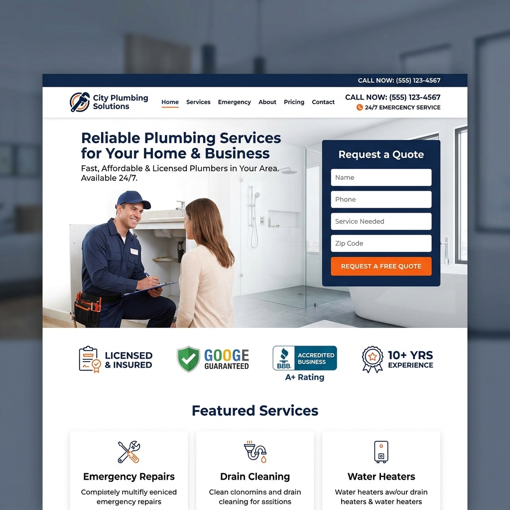
Blueprint 1: The Local Service Contractor
The Strategy: For emergency services (plumbers, electricians, HVAC), the user has a high-stress problem that needs immediate solving. This layout utilizes a massive, sticky header with a highly visible phone number so the user can tap-to-call without scrolling. Trust badges (BBB, licensed/insured) are placed directly under the main headline to instantly establish credibility.
Blueprint 2: The Professional Firm
The Strategy: For high-ticket B2B services, lawyers, or medical professionals, authority and low-friction contact are paramount. This layout places a short, high-contrast lead capture form directly above the fold on the right side. The left side is dominated by a strong, authoritative value proposition and logos of major publications they've been featured in.

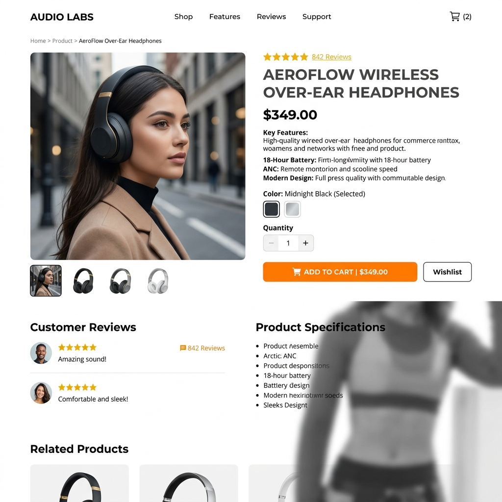
Blueprint 3: The E-Commerce Product
The Strategy: For selling physical products, the visual asset is the most important element. This layout features a massive, high-resolution product image on the left. The right side contains the title, clear 5-star review aggregates for social proof, and a massive, brightly colored, sticky "Add to Cart" button that remains on the screen as the user scrolls down to read the description.